|
|
|


Creating data subsets by applying filters
Statistical Functions on Plotted Data
Introduction
The standalone version of the VOPlot (VOTable Plot) is an application for plotting different astronomical graphs using data stored in VOTable format. It is developed by Persistent Systems, Pune in association with IUCAA, Pune as a part of the Virtual Observatory India (VOI) initiative. Its web-based version is integrated with the VizieR Catalogue Service and can be used to plot any catalogue by selecting output layout as "Plot (VOPlot)". Click here for Release Notes and disclaimer information.
VOPlot uses Ptplot 5.2, a 2D data plotter and histogram tool implemented in Java. Ptplot has been developed at EECS department at the University of California, Berkeley.
Getting Started
To use the standalone version of VOPlot, you will need to download the executable jar file named voplot.jar. The file can be executed by typing the following command at the command prompt:
java -jar voplot.jar
This will open a java application window as shown in the Fig. 0. To use data from a VOTable you will need to load it first. You can either specify the URL of a VOTable or specify the path of a VOTable on your machine by using the “Browse” button. The name of the selected VOTable will appear in the text box. Click on the “Load” button to start using the VOTable. The message on the status bar will indicate whether the file was loaded successfully.
Figure 1

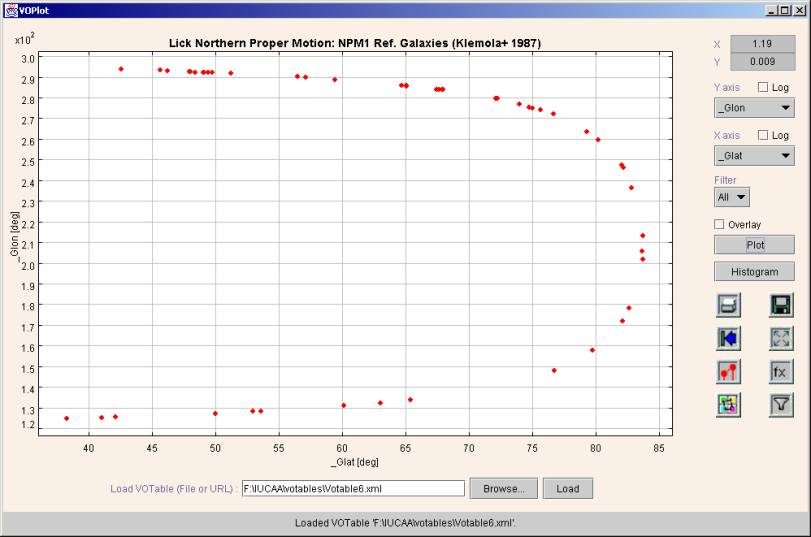
Plotting Scatter Plots
To draw a plot of one columns against the other,
- Select the column to be plotted on the X-axis.
- Select the column to be plotted on the Y-axis.
- Click "Plot" button.
You can see the scatter plot. If required, you can plot log of data points by setting the option appropriately using the "Log" checkbox.
Figure 2
You can draw connected line plots by checking the “Connected” checkbox in the Plot Properties dialog box.
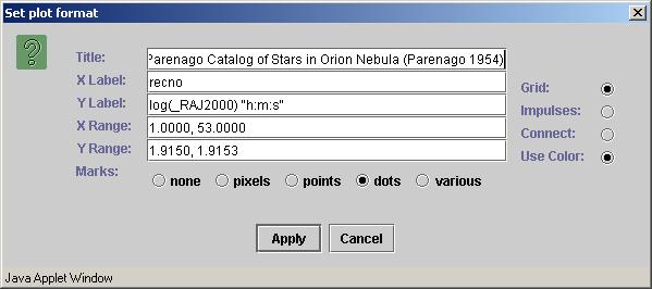
To change various plot
properties, such as title, labels ranges etc., click on the format icon. ![]() .
.
Figure 3
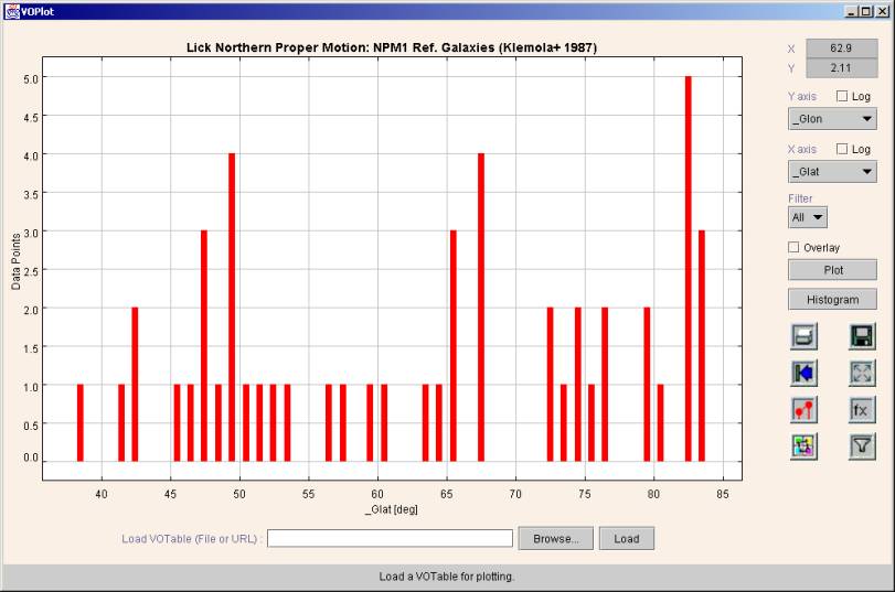
Plotting Histograms
To draw the histogram of a column
- Select the column on X-axis.
- Click "Histogram" button.
A sample histogram is shown in Figure 4.
Figure 4
To plot the histogram bar heights on a logarithmic scale, check the "Log" checkbox corresponding to the Y-axis. If you want to plot the histogram of log of data points, then check the "Log" checkbox corresponding to the X-axis.
When drawing histograms on a logarithmic Y-axis, the bars with height 1 cannot be drawn. You can force the VOPlot to draw such bars by incrementing the height of all the bars by 1. This is done by checking the “Incremented Y” checkbox in the Histogram Properties dialog box
To change the histogram
properties, including the bin width, click on the format icon. ![]() .
.
Figure 5

Zooming
To zoom in, drag the left mouse button down and to the right to draw a box around an area that you want to see in detail.
To zoom out, drag the left mouse button up and to the left.
To get the original graph click
on the "Reset" icon represented by ![]() .
.
Overlaying Plots
To overlay plots (simultaneously viewing multiple plots with similar range on the same axes system)
- Select column to be plotted on the X-axis.
- Select column to be plotted on the Y-axis.
- Click "Plot" button.
- Select column to be plotter on X-axis (represents another plot).
- Select column to be plotter on Y-axis (represents another plot)
- Set the "Overlay" option.
- Click "Plot" button.
You can see the second plot overlaid on the first one if the second one is in the same range as the previous one. Only that portion of the second plot is visible that is within the already plotted range.
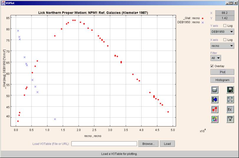
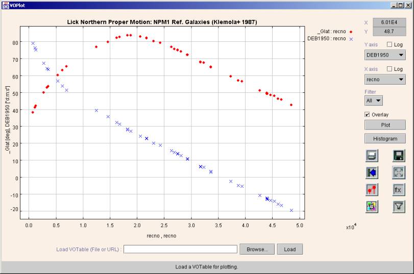
An example of overlaid plots is shown in Figure 6.
Figure 6
To see the plots overlaid
together (even if they don’t lie in the same range) click on the fill icon
represented by ![]() .
Figure 7 shows the complete datasets of all the overlaid plots in the graph
above. A different marker will be used for each plot, to allow one to
differentiate between the plots.
.
Figure 7 shows the complete datasets of all the overlaid plots in the graph
above. A different marker will be used for each plot, to allow one to
differentiate between the plots.
Figure 7
Overlaying Histograms
To overlay histograms (simultaneously viewing multiple histograms with similar range)
- Select column to be plotted on the X-axis.
- Click "Histogram" button.
- Select column to be plotter on X-axis (represents another plot)
- Set the "Overlay" option.
- Click "Histogram" button.
The second histogram is seen only
if it lies within the same X and Y range as the first one. Click on the fill
icon represented by ![]() to see both histograms irrespective of the
range. A different color will be used
for each histogram, to allow one to differentiate between the histograms.
to see both histograms irrespective of the
range. A different color will be used
for each histogram, to allow one to differentiate between the histograms.
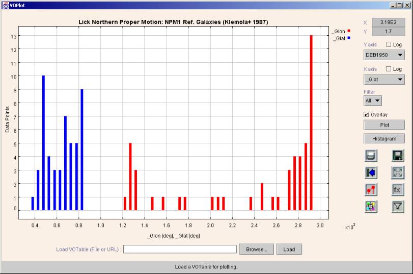
Example of overlaid histogram is shown in Figure 8.
Figure 8
Transformations on columns
One can create new columns by defining transformations on them. You can use expressions with arithmetic operators, trigonometric functions, and miscellaneous functions shown below to create new columns. You can use transformed columns for plotting.
Operators Allowed
|
+ |
Addition |
|
- |
Subtraction |
|
* |
Multiplication |
|
/ |
Division |
Functions
|
log(a) |
Log to the base 10. |
|
ln(a) |
Log to the base e. |
|
pow(a,b) |
"a" raised to power of "b". |
|
sqrt(a) |
Square root of "a". |
|
exp(a) |
Euler's number e raised to the power of "a". |
|
dexp(a) |
10 raised to the power of "a". |
|
cos(a) |
Trigonometric cosine of an angle. a = an angle in radians. |
|
acos(a) |
Arc cosine of an angle |
|
sin(a) |
Trigonometric sine of an angle. a = an angle in radians. |
|
asin(a) |
Arc sine of an angle |
|
tan(a) |
Trigonometric tangent of an angle. a = an angle in radians. |
|
atan(a) |
Arc tangent of an angle |
|
toradians(a) |
Converts an angle measured in degrees to an equivalent angle measured in radians. |
|
todegrees(a) |
Converts an angle measured in radians to an equivalent angle measured in degrees. |
Creating new columns
- To define transformations on columns click on the Transformations
Icon represented by
 to display the Transformations Dialog
Box.
to display the Transformations Dialog
Box. - In the Transformations Dialog Box, you can see the column names, their Id (used for expression building) and the expression with which they were created.
- For creating a new column, type in the new column name (example f1Glat) and the expression using the functions shown above. Example: $1+sin($3)*4
The dialog box for creating new columns is shown in Figure 9.
Figure 9

Creating data subsets by applying filters
You can create new data subsets by defining filters on them. You can use conditions with relational operators and logical operators with operators and functions shown above to create new data subsets. Data subsets can be used for plotting.
Operators Allowed
|
< |
Less than |
|
<= |
Less than or equal to |
|
> |
Greater than |
|
>= |
Greater than or equal to |
|
== |
Equal to |
|
!= |
Not equal to |
|
&& |
And |
|
|| |
Or |
|
! |
Not |
Creating new data subsets
- To define new data subsets on columns click on the
Filters Icon represented by
 to display the "Create new data
subsets" dialog box.
to display the "Create new data
subsets" dialog box. - In this dialog box, you can see the column names, their Id (used for expression building) and the expression with which they were created. You can also see the data subsets that you previously created with their names and conditions.
- For creating a new data subset, type in the new subset name (example f1Glat) and the condition using the functions and relational operators shown in table above. You can also make use for arithmetic operators and functions listed for "Transformations on columns". Example: $1 > 0 || ($3 != 0 && $2 > 100)
The dialog box for creating data subsets is shown in Figure 10.
Figure 10

Once a data subset is created you can plot data from the subset. This can be done by choosing the data subset from the Filters combo box in the main applet window.
Note: "All" represents the complete data. Only data points in this data subset will be considered for plotting.
Statistical Functions on Plotted Data
Statistical functions can be applied on the plotted data.
Applying Statistical Functions
- To apply statistical functions, click on
"Statistics for the plot" icon represented by
 .
The "Plot Statistics" dialog box will open.
.
The "Plot Statistics" dialog box will open. - You can choose the data subset from the filter combo box. Note: "All" represents the complete data.
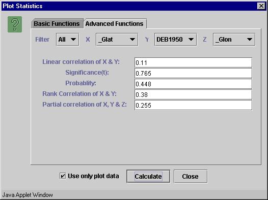
- Select X, Y and Z axes and click "Calculate" button. Note: Default columns are picked up from the current plot. The results are displayed on the same window.
The dialog box is divided into two tabs – basic and advanced functions. The basic functions require only one data array, while the advanced functions require two or three data arrays as parameters.
The following statistical functions are currently supported.
|
Sr. No. |
Function name |
Input Columns |
|
1 |
Number of observations |
X |
|
2 |
Range |
X |
|
3 |
Minimum |
X |
|
4 |
Maximum |
X |
|
5 |
Mean |
X |
|
6 |
Variance |
X |
|
7 |
Standard deviation |
X |
|
8 |
Skew |
X |
|
9 |
Kurtosis |
X |
|
10 |
Linear correlation |
X, Y |
|
11 |
Significance (t) for Linear correlation |
X, Y |
|
12 |
Probability for Linear correlation |
X, Y |
|
13 |
Rank correlation |
X, Y |
|
14 |
Partial correlation |
X, Y, Z |
VOPlot, by default, takes the complete dataset into consideration while evaluating the statistical functions. However you can force it to consider only the plotted data range by selecting the "Use only plot data" checkbox. This will evaluate the statistical functions for the currently plotted columns, along with the applied filter, if any, in the current axes ranges.
Sample dialog box with basic tab selected showing plot statistics is shown in Figure 11.
Figure 11

Sample "Advanced Functions" tab is shown in Figure 12.
Figure 12
Saving plot as an image
For saving the plot as an image, plot
the desired image and click on save icon represented by ![]() .
The save as dialog box will appear. Select a file and click on OK to save the
image as an EPS file onto your machine. Currently, the image can only be saved
as an EPS file
.
The save as dialog box will appear. Select a file and click on OK to save the
image as an EPS file onto your machine. Currently, the image can only be saved
as an EPS file
Feedback Address
For feedback on VOPlot contact voindia@vo.iucaa.ernet.in.